CAMWorks UI/UX Proof of Concept
Adaptive UI Design for CAMWorks in Embedded CAD Environments
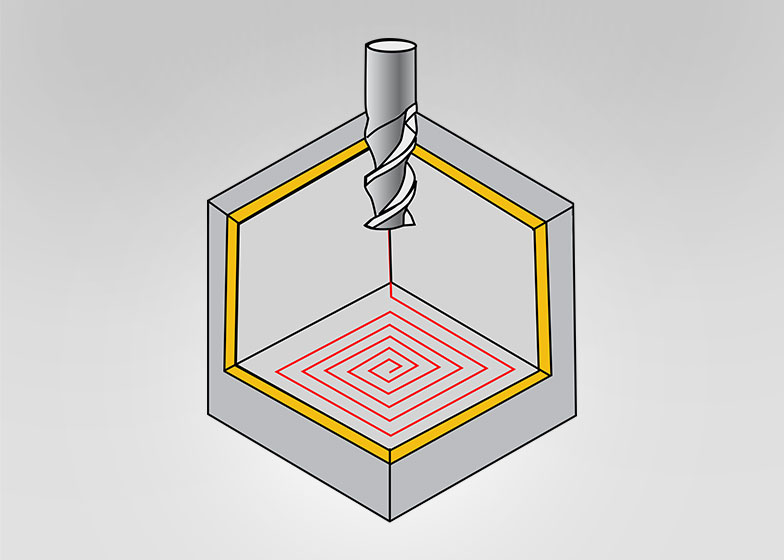
This is a proof of concept (POC) I worked on for CAMWorks several years ago. While the visual design may appear dated by today’s standards, the underlying use case was instrumental in helping me understand how user experience and interface design function within CAD/CAM systems.
Since CAMWorks runs inside various CAD platforms—such as SolidWorks and Solid Edge—it became clear to me that the design approach needed to be adaptive. For example, when operating inside SolidWorks, the icons should align with SolidWorks’ visual style. If it’s running inside Solid Edge, the design should blend into that environment. In cases where CAMWorks operates independently, it should have the flexibility to carry its own distinct style while maintaining consistency and usability.
The user interface also presented a broader design question: should CAMWorks stick to legacy workflows resembling the Windows XP-era UI, or move toward modern paradigms like those seen in Windows 8 and newer? Given that most users operate within Microsoft environments, I believed that adapting to the newer OS style—expected to be prevalent for the next several years—was a practical and user-friendly decision.
During my exploration, I experimented with updating the icons to a flat, modern style while keeping the ribbon toolbar intact. However, the change didn’t land as well as expected. It became apparent that most users—many of whom are seasoned SolidWorks professionals—preferred a familiar visual environment. A sudden departure from that could be disorienting.
That insight led me to a more nuanced approach: rather than pushing radical UI changes, I focused on a design strategy that embraces the host environment. By using “camouflaged” icons and workflows that feel native, I aimed to create a seamless experience—one that introduces subtle improvements without disrupting the user’s mental model. Even though CAMWorks is embedded within SolidWorks, I wanted its presence to be felt through ease of use, helpfulness, and thoughtful design—not through visual noise.
At the time, CAMWorks’ visibility was minimal—limited to two 16×16 icons near the operation tree and one text button in the menu bar. That constraint further encouraged me to explore minimalist, high-impact solutions.
This POC became a foundation for my thinking around adaptive UI strategies within host applications. It’s a small but meaningful example of how design can respect context, reduce friction, and still bring clarity and improvement to complex technical environments.
Client
- Geometric
 camworksA2
 camworksB2